Choreography
Learn rhythmical movements in time to music.
- Hip Hop
- Jazz
- Ballet
- Fusion
- Performance Dance
- Salsa
- K-pop
Previously Product Design @ Rockstar Games


Learn rhythmical movements in time to music.

Burn calories in the most fun way ever.

Work on your strength and flexibility.


My ongoing quest is to create captivating experiences with lasting emotional impact. At Rockstar, I led and launched a content platform that lets non-technical folks build and ship for tens of millions of players. Before that, I worked alongside founders and led design at Giving Tech Labs and WollenDance, turning loose, early ideas into products that moved the business.
Outside of work, I'm a crisis counselor at Crisis Text Line, mentor on ADP List, and food hunting in Queens, NY. At times, I (over)think and write about people and the ever-changing world.
 Aigentless ↗
 An app to modernize the apartment hunting process by offering AI-powered, self-guided experiences. I designed a tour-quality matching concept, reframing renter dealbreakers from filters into tour-protection.


 David Kerr Lead Frontend Engineer, Rockstar Games Wei's design work is consistently world class, rendering complex proposals with detailed interactions into engaging and intuitive experiences.
  Katie Hogan Product Manager, Rockstar Games Wei consistently impressed me with her ability to blend product strategy with exceptional design execution. She has a true product mindset.
  Kevin Joh Marketing Analytics Manager, Rockstar Games Wei is defined by her curiosity and diligence, willing to deeply engage in her projects and with others. Her work ethic is exemplary, setting a high standard across the board.
  Byron Benton AI/ML Product Leader Wei's knowledge and expertise are truly impressive, and she has a unique ability to break down complex concepts into something easy to understand.
 Work /
1 month · 0→1 · internal tooling
WollenDance runs live and on-demand classes across dozens of independent studios. Scheduling lived in back-and-forth email and spreadsheets, so one cancellation rippled out as stale info and students showed up to classes that had moved. I designed the admin tool that gave everyone one schedule they could trust.
+12% satisfaction
from semi-yearly member survey
Email + spreadsheets → one source of truth
studios, admins, and instructors on the same schedule


╌╌ END ╌╌
3 weeks · system design · tooling
How Rockstar's content team went from rebuilding pages from scratch to shipping them in a fraction of the time, while preserving the craft.
80% less QA
Only new components tested, not full pages
95% CMS-driven
From fully hard-coded to system-managed
1 quarter → 1 month
Production time for a title update
Lead designer on the content system: defined the content entity model, ran the experiment that proved the concept, and drove the build across screen, production, and engineering teams.
Production for a new title update dropped from a full quarter to one month. New surfaces no longer required new assets or bespoke layouts, just different expressions of the same content.
Rockstar is known for craft. Every detail is deliberate: lighting in a cutscene, the composition of a single frame. Early on, I watched a team spend an hour debating the crop of an image. It felt excessive until I realized those decisions compound into something players can feel. That unmistakable sense of quality comes from consistency of intent. I stopped seeing the scrutiny as waste and started asking a different question:
How do we preserve that level of craft across the website?
As the website evolved alongside DLC releases, that consistency started to break down. For every update, multiple teams were involved: in-game, marketing, community, production, engineering. Communication ran through PMs. But color nuances, layout behavior, and technical decisions don’t survive a game of telephone.

This showed up in constant feedback like:
“This character gets cropped on tablet.” “That vehicle needs to be centered on mobile.” “Can we shift this left only at this breakpoint?”
At Rockstar, those aren’t cosmetic issues. Cropping a character changes the meaning of the image. Composition is part of the storytelling.
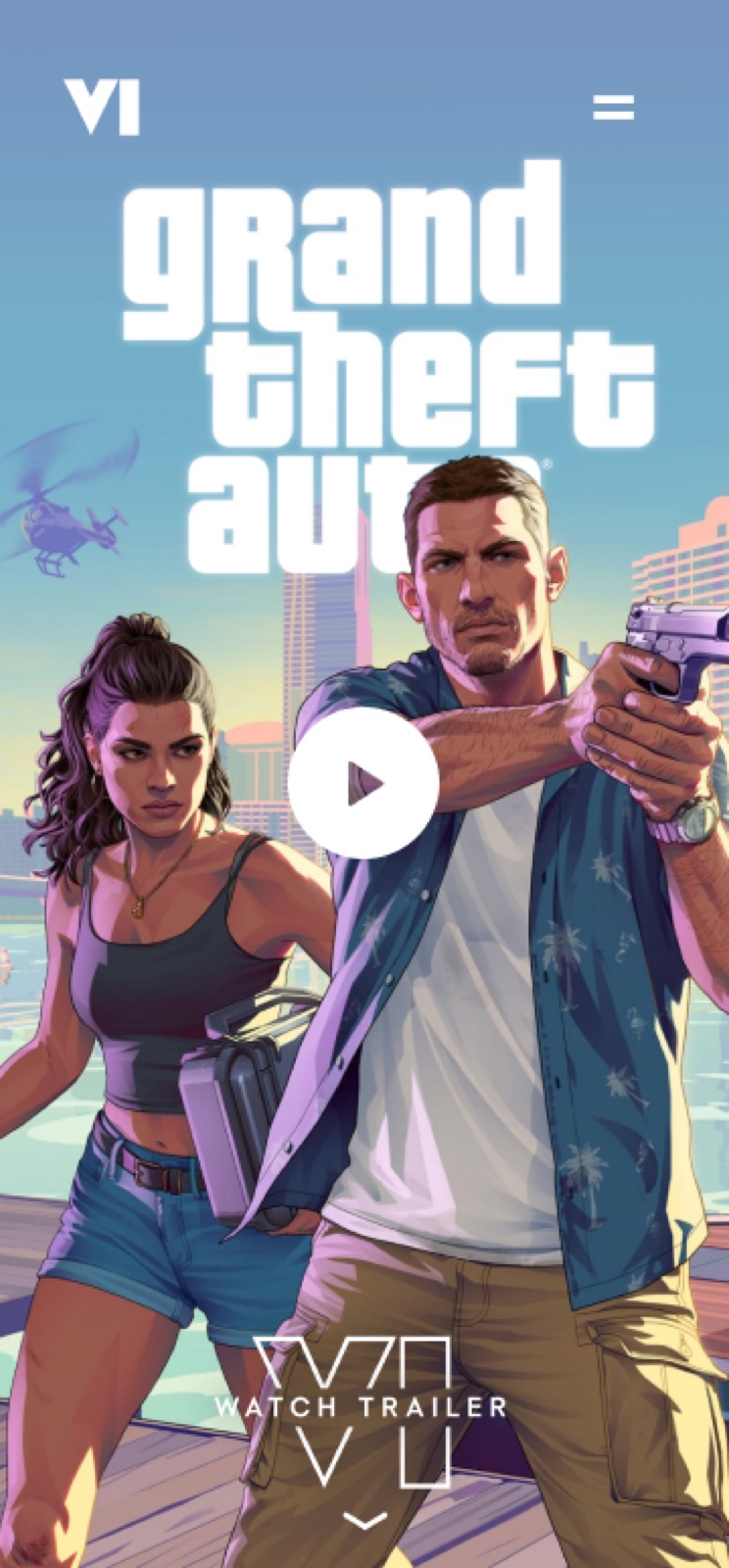

Each asset went through 6–8 rounds of feedback. From the outside, it looked like slow execution. In reality, it was creatives repeatedly re-explaining intent that the system had no way to preserve.
The instinct was to fix the process: remove the PM layer and have creatives talk directly. In practice, those conversations expanded into endless “what if” scenarios, and timelines slipped. The real problem wasn’t process. It was that no one was actually seeing the same thing.
Each team had a clear view of their piece, static tools on one side and responsive outputs on the other, but no shared way to understand how an asset would behave once it left their hands.
Instead of introducing a new tool, I started small. I translated responsive behavior into the format creatives already used, to see if it would land. Designers could edit drop assets and immediately watch how they changed across breakpoints, in real time.
Feedback dropped from 6–8 rounds to 1–2. Creatives could see outcomes directly instead of interpreting specs. The ambiguity disappeared.
4–6× reduction in feedback cycles per asset. We weren’t missing process. Creatives don’t need more documentation. We were missing a shared visual language that could carry intent across tools and teams.
If an image carries intent, the system needs to understand what must be preserved in each context. The web treated these as separate files, rather than a single content entity with intentional expressions. I designed the system around the entity. One content object holds all its expressions, and the system serves the right variant for the right context: breakpoint, aspect ratio, or device orientation.

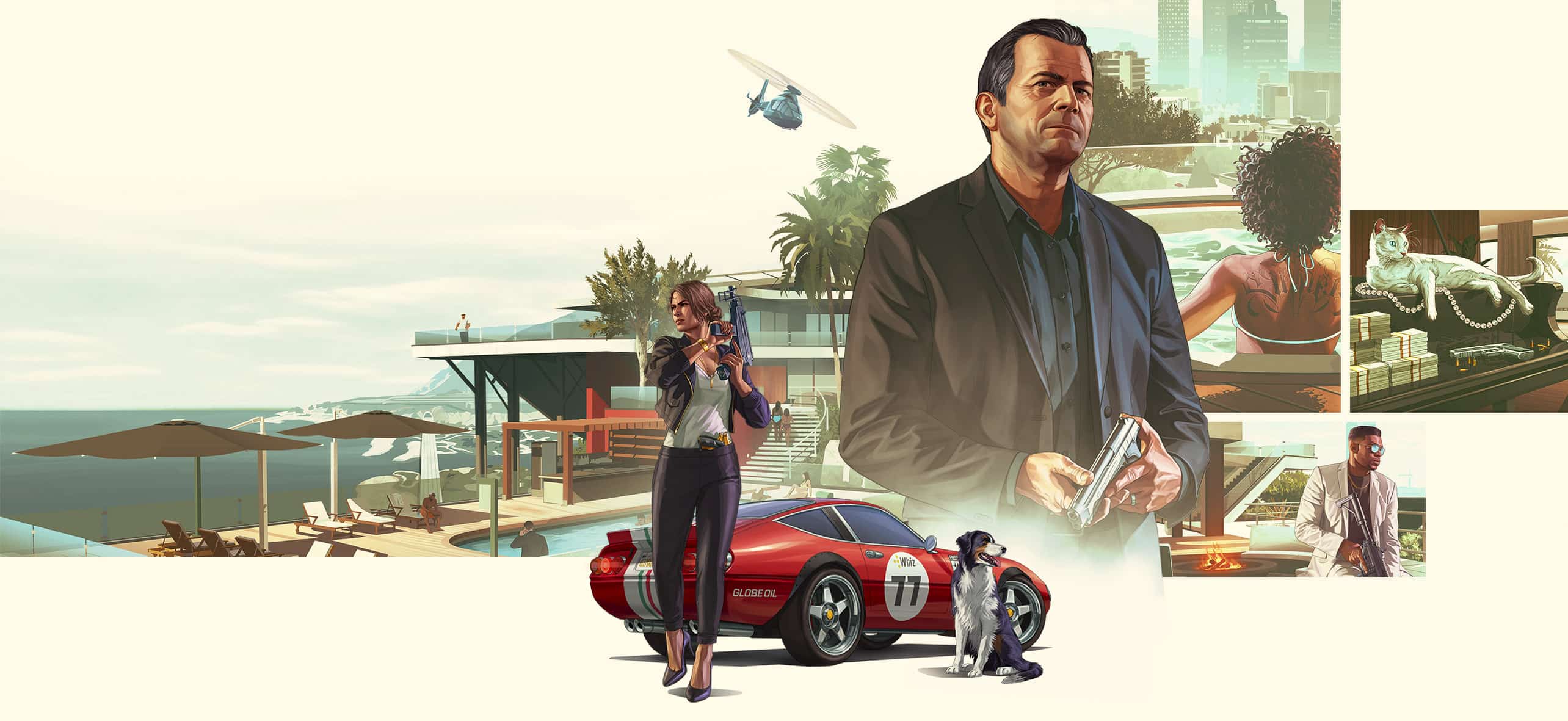
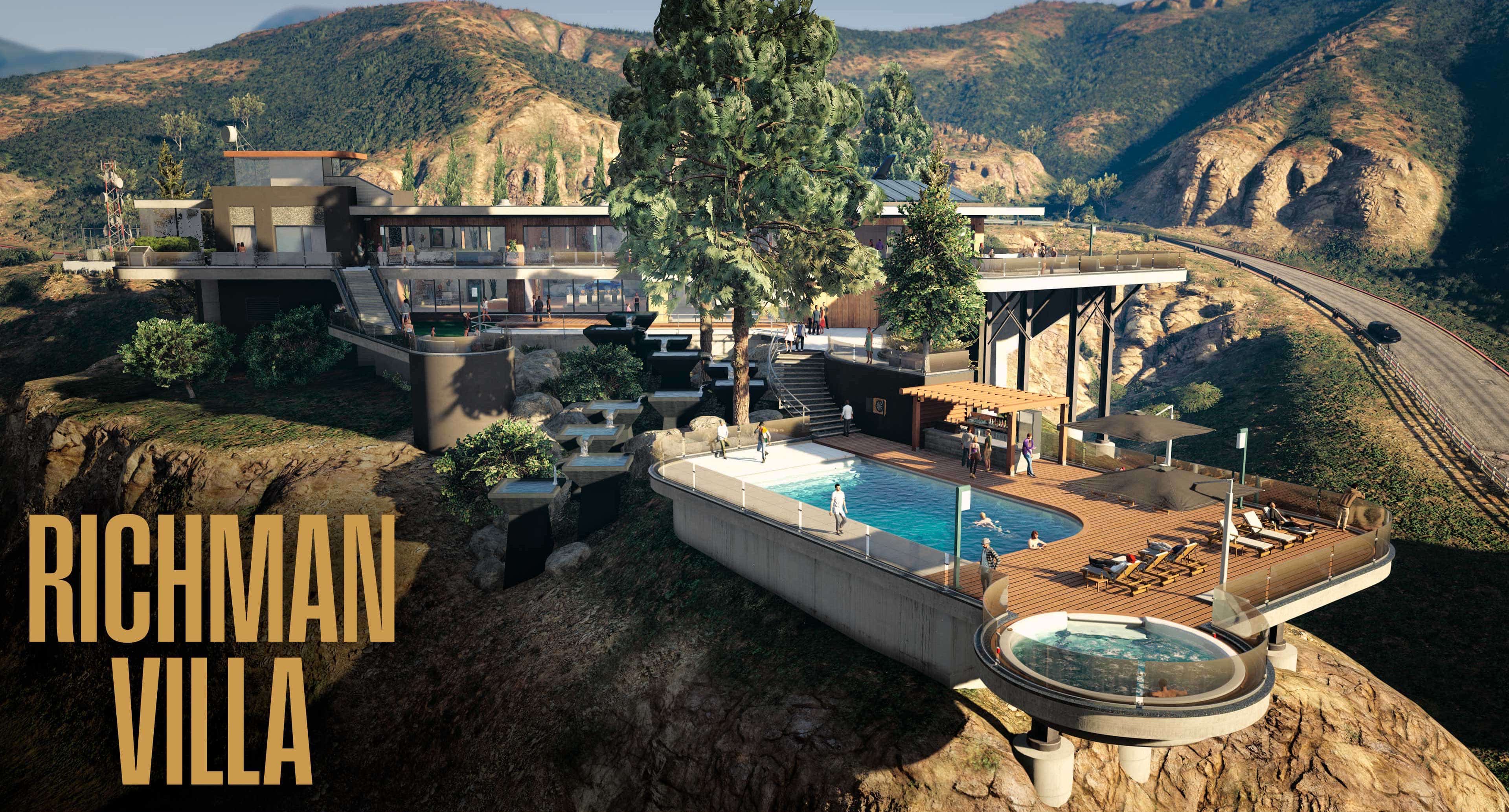
Status is everything. In A Safehouse in the Hills you can revel in your rightful position amongst the city's elite with a lavish new mansion property.
Content Entity
A Safehouse in the Hills
safehouse_in_the_hills_16_9
Key characters and vehicles must remain fully in frame across all viewports. The composition is intentional — do not reposition or fill.
Shared Properties
Switch viewports and expressions — one content entity, the right composition for each surface.
The system formalized the work art and production teams were already doing manually. It turned ad hoc asset management into structured, intent-driven content.
The model extends beyond breakpoints. Take a single GTA Online event. The underlying content stays constant: rewards, drops, discounts, challenges. On Newswire, it appears as a 16:9 editorial image, composed for narrative. In the event stack, the same content resolves into a tight 1:1 for collapsed cards.
Different surfaces. Same entity. Product context becomes a selection problem, not a redesign exercise.
Acknowledgements: Jennifer Kim coordinated across departments and kept the project on solid ground. Jack Koloskus helped me think more clearly about data models than I would have on my own. Sam Yu and James Zdaniewski gave feedback that shaped where the work landed.
╌╌ END ╌╌
2 months · design systems
Turning subjective visual judgment into scalable behavior.
Weeks → Days
QA cycles, once gradients stopped being tuned case by case
1 input
editors set a gradient with a single CMS color
6 themes
GTA VI trailer site, one system, one color each
Led the design of a media-first gradient system — how interface layers sit on top of high-fidelity game assets. Worked across design, art, content, and engineering to translate Rockstar aesthetics into a consistent, implementable system.
QA cycles compressed from weeks to days. Non-designers can update gradients through a single input model. It later scaled to the GTA VI trailer site, where gradients became a core storytelling layer, guiding narrative transitions through scroll.
At Rockstar, image or video isn’t decoration. It is the experience. A character portrait, a vehicle, a scene from gameplay, or a detail from the world is what pulls players in. But media still needs a content layer to retain a sense of purpose: title, navigation, calls to action. The challenge was to present the content without obscuring the media in the background.
When that layering goes wrong, it doesn’t just look off — it breaks the experience itself.
To make the content layer readable, we applied uniform gradients across assets. Standard practice. Black gradients made everything legible, but flattened the image, muted key details, and sometimes covered the very thing meant to attract players. Feedback came back consistently:
“This is fighting the asset.” “This feels too heavy.”


“Too heavy” sounds like a personal taste, not actionable on its own. It could mean opacity, coverage, placement, or all of them at once. What looked like a simple tweak exposed a deeper issue:
This wasn’t a visual polish problem. It was a system that couldn’t translate taste into decisions.
If the problem was translation, the first thing was to find a place where visual decisions could be compared and made consistent. I started with card components — fixed aspect ratio, consistent content structure — trying to answer: what actually makes a gradient “too heavy” or “fighting the asset”?
I broke it into measurable decisions:

From that, I defined working rules:
This turned vague feedback into something actionable.
The rules worked. The composition held together better. We solved it visually, but not operably. Engineers were concerned: “Customized color for each asset? This is going to explode in complexity.” They were right to question it — it would quickly turn into inconsistency and maintenance overhead. And from the content side, the question became “who decides the gradient color?” If every asset required design input, the system wouldn’t scale.
At this point, the problem shifted from “what makes a gradient work?” to “how do we make this work operable by different teams?”
I unpacked it into two aspects: what gets controlled by the system, and what by the editor?
Editors provide a single color input. The system derives all gradient behavior — coverage, fade, and positioning — ensuring consistency without requiring design intervention.
No custom logic per asset. Consistency without rigidity.
The system worked in fixed comps, but broke under real content. As text length changed, the readable area moved — making fixed gradient percentages unreliable. Across breakpoints, the misalignment became more visible.

Instead of tuning values, we shifted to relationships: anchoring gradient behavior to the content layer so it adapts with the layout.
Figma let us define the gradient as fixed percentages. It couldn’t express what we actually needed: a gradient that adapts to the text. That exposed a deeper issue in how we communicated.

Specs based on static values led to constant clarification. That’s when I stopped prescribing values and started defining intent.
That shift turned implementation into a shared problem, moving conversations from “what number?” to “how should this behave?” Since then, intent has become the baseline for how we spec and communicate with engineering — behavior and rationale over prescribed values.
On the GTA VI trailer site, gradients took on a new role. We rolled out six places. Six distinct tones. We used gradients to carry that difference. Change the base color, and the gradient geometry takes care of the rest.
This time, we didn’t design six times — we applied the same underlying system. Change one color input, and each theme behaves the same but feels different. All six use the same gradient angle — 223.17 degrees — so the perceived light direction stays consistent even as colors shift.
Perceptually, it feels like the world is changing color, not like one slide is replacing another — which is the mood we want for the GTA VI world.
Gradients stopped supporting the page. They started connecting the experience.
Treating the gradient as a small design system meant handing engineering a data structure, not a design file. An array of seven colors per section. The runtime does the rest. Palette in, scene out.

Once the system was in place, QA cycles that used to take weeks compressed to days, because gradient decisions were no longer made case by case. Before this, feedback like “too heavy” wasn’t actionable. Turning that into a system made it usable.
This started as a gradient that felt off on a card. It became a connective layer across an entire product.
What surprised me was how much range the system had once gradients became scroll-driven. Once scroll position becomes the clock, it can drive anything that changes smoothly: color, angle, blur, opacity. The result can feel visually new, but it comes from a simpler place: a small set of primitives and relationships, applied consistently.
That’s what made taste workable. A gradient that “feels too heavy” is abstract until you reduce it to what it actually controls — how much it covers, where it sits, how it moves. The subjectivity just gets a structure the team can reason about together.
Pick one primitive, use it consistently. Let it scale further than you planned. That’s how you translate taste into a system others can use.
Acknowledgements — Matthew Alessandri asked the right question at the right time: “Is there a rule for all these logo sizes?” That led to a more consistent readable area across cards and, unexpectedly, simplified the gradient logic itself. Bobby Marcus pushed me to think about gradients as something the browser actually has to render; understanding the implementation cost led us toward a simpler, more efficient solution.
╌╌ END ╌╌
2 months · 0→1 · nonprofit tech
Designed the incentives that got 230+ nonprofits onto an empty platform in the first month.
230+
nonprofits published their work in the first 30 days
Fast Company '22
World Changing Ideas honorable mention
4 of 5
loop steps activated in production
Lead Product Designer. Designed the contributor experience as a five-step participation loop, refining each step as users showed what they needed.
230+ nonprofits posted their work on a previously empty platform in the first month. Fast Company World Changing Ideas 2022 honorable mention.
A workforce training program with an 80% job placement rate couldn’t run its next cohort because it couldn’t get funded. Meanwhile, $109 billion in foundation grants flows annually in the US. But the top 1% of foundations control 57% of all grant dollars, and the money moves largely through existing relationships.
Many nonprofits are doing impactful work and can’t be seen. Programs that could change lives run out of runway before they can grow.

So we built the most direct path: a clean form for nonprofits to document and publish their work. The assumption was straightforward — if nonprofits could clearly present their work, foundations already looking for aligned programs would be able to find and fund them.
The reality? Nobody showed up. We sent it to more than 20 nonprofits in Washington. They said it sounded great, that they’d send something over. Weeks passed. Nothing came in.
The form had a question that asked, “What impact did you make in the last fiscal year?” Most nonprofits don’t have that ready. They’d start the form, hit the question, and close the tab.
Nonprofits wanted visibility, but the cost of participation was too high relative to the value they could see.
The question became: how do we get nonprofits incentivized enough to publish their work?
The system stalled because it was designed as a one-way extraction of data rather than a functional loop. To start, I sketched a five-step participation loop.

Each step was meant to lower the cost of the next. Each design decision that followed was an attempt to validate these steps against reality.
Instead of a long form upfront, I split contribution into two paths: create and develop. Create was the lightweight entry point — a few essential questions, under five minutes. Develop was the deeper path, for people already invested who wanted to go further.
We let organizations become visible before they were complete.
By allowing visibility before completion, the number of new challenges jumped immediately. But many just stopped at the basic setup.
The better orgs write about their work, the better their chance of getting funded. Funding kept coming up in conversations, unprompted. Nonprofits wanted to know who funds work like theirs, and where the money was flowing. Dr. Ying Li had built a knowledge graph of 10 years of foundation grant data — every grant given by every foundation in the US.
We had what nonprofits were asking for, just not usable in its raw form.
I structured the data around the two questions nonprofits kept asking: what they work on, and where. A geo map of the US showed where money was flowing. A UN SDG filter showed which issue areas were attracting support. A housing nonprofit in Texas could see whether housing was getting funded in their state, or whether the money was going elsewhere. I built the dashboard as a reward once users finished 75% of the challenge writing.
We’d designed the platform assuming nonprofits came to be seen: post their work, get noticed, get funded. The usage data told a different story. Nonprofits were reading each other’s challenges. An education nonprofit in Washington would read three or four challenges before starting their own.
The platform transformed from just posting to finding peers and figuring out who else was working on the same thing.
I treated this as a chance to introduce social proof:

As more nonprofits found their way in, the platform got busier — and harder to navigate. A foundation looking for credible work to fund now had to wade through hundreds of challenges across dozens of issue areas.
The difficulty of navigation was hurting impactful work that should have been easy to surface, and putting the platform at risk of becoming a repository of contributions rather than a system for discovery and action.
The platform needed better tools for finding what mattered. Discovery helped users find content they cared about.
A foundation deciding whether to engage with a challenge is really asking two things: Is this a real problem? And did the people writing it know what they were doing?
The first question was already answered by data nonprofits contributed. The second was harder — nothing on the platform told a foundation whether the writeup itself was any good. I added two signals.
Verified nonprofit members could upvote challenges. An upvote from someone who works in the sector means something specific: this looks like real work to me. Anonymous upvotes don’t carry that weight, so the platform tracked verified votes separately and showed that count on the card. The second signal was completion rate, surfaced as a tag, so a foundation could see at a glance how much the nonprofit had invested in articulating their work.
It changed behavior. Challenges that scored well drew more outreach from foundations and tech providers. Contributors could see what happened when they did impactful work and wrote well — which gave them a reason to.
To get people to visit more frequently, I worked on helping them find work in their issue area faster. The 17 UN SDGs are the shared framework across nonprofits, so I used that as the main organizing layer.
The original UI was a dropdown; users had to read down the list to find what they wanted. I changed it to a wheel that was mobile-friendly and scannable at a glance.
I added a downvote on each challenge meaning “this isn’t what I’m looking for.” After 3+ downvotes in a session, the system surfaced a “Refine Search” prompt to help users narrow scope instead of scrolling further.
What we built, in the end, was almost a five-step loop. Some moves were planned from the start. Others emerged as we watched nonprofits behave in ways we hadn’t designed for.
The first four steps activated. 230+ nonprofits posted their work in the first month. The dashboard drew them back during their first session. Peer browsing became a real behavior. Foundations and tech providers started reaching out to challenges that scored well on the credibility signals.

But the fifth step didn’t. We’d given people a reason to come, but not a reason to return. Without people coming back, the network effects didn’t form.
Lowering the cost to enter was necessary. It wasn’t enough. A platform like this has to keep giving people reasons to return — new peer challenges to learn from, new foundation activity to track, new collaborations to join.
What I’d do differently: the Money Flow dashboard should have kept updating after the first visit. All of it was already in the data — new funding in a nonprofit’s area, other organizations claiming their challenge, foundations paying attention. The platform just never told the nonprofit.
A loop isn’t only about making it easy to join. Each step has to give people something new every time they come back. We built the entry. We didn’t build the reasons to return.
Acknowledgements — Dr. Ying Li developed the knowledge graph and data ingestion that powered the funding dashboard. The nonprofit and foundation interviews that shaped how I understood the problem came from the AI4PI Fellowship.
╌╌ END ╌╌
3 months · player tool · immersion
What it takes to make a web tool feel genuinely GTA.
58% → 92%
Completion rate, before and after the redesign
34% conversion
Players completing the flow in the first month
6 months
Of sustained engagement growth after launch
Lead designer. I drove the core framing decisions — stripping the experience to make the plate the star, then finding the right way to bring the car back. I ran testing with real players and brought in game and motion team partners to solve the brand-authenticity problem.
34% conversion in the first month. Completion rates rose from 58% to 92%. Sustained engagement growth over six months — and the design principles we defined here became the framework for around-game web experiences going forward.
The iFruit companion app had over 109 million users, but it was broken and aging. No one planned to maintain or upgrade it for next-gen games. We had to sunset it.
Buried inside this clunky app was one feature players still loved: the custom license plate editor. Despite the overall poor experience, it was still getting millions of uses every month.
Instead of letting that engagement disappear with iFruit, we treated the license plate editor as an opportunity: could we rebuild it as a modern, around-game web experience that felt like GTA — and actually worked?
Like many complex products, iFruit tried to show everything at once. Hundreds of possible paths. Lots of clutter. The first step was to strip it down to the core flow and get everyone aligned on what really mattered.
We started with a quick prototype to make the experience tangible. Instead of debating abstract flows, we let people click through it.
In the early version, we leaned into cars, with a fast transition between a car view and the plate editor. It looked cool and excited players in testing — but it also confused them. People weren’t sure what the primary task was. Were they here to look at cars, or customize plates?
The insight was straightforward: if the tool is about license plates, the plate needs to be the star.
We simplified the navigation, removed distractions, and made the plate the central object. Everything else became supporting context.
Once we clarified the core flow, the next challenge was how to make it feel effortless, especially on small screens.
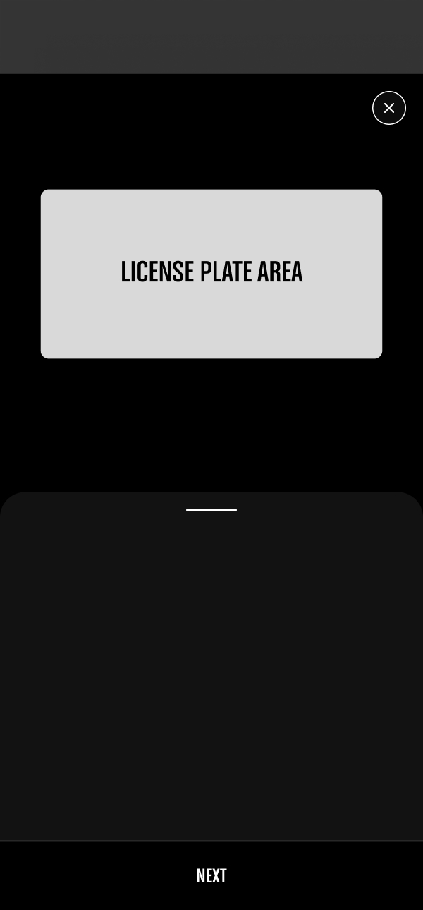

We explored a pattern with three clear states: an initial overview, an action-focused editing state, and a review state. The goal was to keep the key action front and center while still offering room for exploration.
We prototyped this and tested it with seven players.
The flow was complete, but there was a problem: players said it didn’t feel exciting. Customizing the plate felt like a chore, not something they looked forward to.
That was a red flag. In Grand Theft Auto, cars are core to the fantasy. If this tool was meant to extend the game world onto the web, the experience needed to echo that car-driven identity, not just present a form with inputs.
So the question became: how do we bring the car back in, without overwhelming the plate or making the flow clunky again?
Our first idea was to render each player’s actual in-game car. It would have been amazing — and completely unrealistic given the technical and production constraints.
Next, we explored using a generic car. But which one, and how stylized should it be?
We brought in partners from the game and motion teams and started brainstorming. We iterated on how minimal a car representation could be while still feeling like GTA: clay-like shapes, wireframes, dark lighting, different composition options.

After several rounds of discussion, we landed on the Bravado — a car that players instantly recognize, but subtle enough to let the license plate stay in the spotlight.
From there, we designed the car and plate interaction for both desktop and mobile. The car created an immersive, GTA-authentic frame around the core task of customizing a plate.
A big technical challenge was how to shift between car view and plate view while allowing rotation. Players could spin the car to any angle, so transitions between states had to feel smooth, regardless of where they left the camera. I worked closely with our UX engineer to experiment with different transition patterns until the motion felt both fluid and predictable.
In parallel, we had to fit four key controls into a very small area. The UI needed to support both 2D and 3D views for device compatibility without feeling cluttered. We explored a range of toggle patterns and settled on an approach that made the actions clear at a glance while staying out of the way of the core plate customization.

After launch, we saw a 34% conversion rate in the first month. Players weren’t just landing on the page — they were completing the flow.
We also saw an increase in returning users. Players came back to create new plates and place orders more frequently, which told us this wasn’t just a one-time novelty. The feature created a small, personal bond between players and the game.
For Rockstar, this was the most radical change to the license plate experience since 2013, and the data gave us confidence to continue investing in new plate styles and around-game experiences.
Over the first six months, we saw an initial spike followed by a steady increase in engagement. That sustained growth validated the decision to slow down, design deliberately, and aim for quality over quick wins.

This project was the first time we tried to articulate clearly the principles behind these experiences: Simplicity, Fluidity, and Delight. These became the framework for every subsequent project.
Living by those principles is not always easy. It meant making conscious trade-offs and sometimes choosing a slower path to launch in order to create a world-class experience. This project helped prove internally that this approach isn’t just “nice to have.” It’s a competitive advantage.
Alongside those three pillars, we stayed grounded in fundamentals from day one: utility, performance, accessibility, security, and reliability. The experience had to be beautiful and fun — but it also had to be fast, dependable, and respectful of players’ time and context.
Creating experiences that truly resonate with players is demanding work, but it’s also deeply rewarding. Our lives are full of small digital moments. Adding a bit of magic to those moments feels important.
Acknowledgements — The License Plate Web Tool was a collaborative effort across design, engineering, and 3D motion. The 3D rendering featured throughout the experience was led by Ben Wiley and the Rockstar Games 3D motion team. Special thanks to Dan Maffin for consistently upholding a high design standard throughout the project, and to Bobby Marcus and Ivy Cheng for their contributions across the work.
╌╌ END ╌╌
1 month · information architecture
Helping COVID-era newcomers find a dance class they'll love, without breaking the fast paths repeat users rely on.
3× traffic
The surge when COVID moved dance classes online
2,000+ classes
The on-demand library new users had to navigate
5 prototypes · 3 rounds
Usability testing that reshaped the design

Product designer. Redesigned the class discovery experience for a 2,000-class dance platform — balancing new visitors who need guidance against repeat users who rely on fast search-and-filter paths.
A discovery experience validated across 5 prototypes and 3 rounds of usability testing — guiding new visitors through 2,000+ on-demand classes while protecting the search-and-filter paths repeat users depend on.
When COVID hit, our online dance platform saw a 3x increase in traffic. For the first time, most visitors were coming from organic search and ads — not from studio referrals. These new users landed on a dense gallery of 2,000+ on-demand classes and quickly got lost.
My mandate as the product designer: redesign the class discovery experience so that new visitors can confidently find a class they love, without harming the fast paths that repeat users rely on.
We didn’t want to offer an exhaustive list of classes; we wanted to focus on helping users discover dance classes they’ll love, from the 2,000 on-demand classes.
Our UX research was to assess users’ current behavior and expectations about the function.
Among the participants who are our current users, they jumped right into either the search bar or filter to find classes from certain studios or instructors. New users were generally confused by the representation of classes.
“I usually look through video previews to pick a class.”
“It’s annoying that detailed class info disappears when hovering.”
“I’m not focusing on reading text when scrolling. My eyes immediately fall to the images instead of the text on the cards.”
“I would use a Style + Level filter to help narrow down the selection.”
“I don’t understand some of the styles, such as ‘Powerful.’”
“All the classes look similar — I don’t know which one to pick.”
The biggest challenge I faced throughout this project was balancing two different user mental models — new visitors and repeat users. Since this redesign touched every part of the website, I needed to coordinate and get buy-in across teams, and the mix of viewpoints made it even more challenging. The content team had spent significant time re-defining the style of every class around professional dance terms — with no evidence that those styles aligned with users’ mental models.

My first design challenge was to propose how we’d display content on the platform for both current and new users. I hypothesized that making dance content a priority would be key to encouraging new customers to subscribe. With 20+ styles on the platform, how do you re-structure to reduce upfront decision-making and cognitive load, and carry a stronger information scent that invites customers to explore?
My first attempt was to regroup styles by dance goals to simplify the discovery path. My assumption was that users usually have a clear goal in mind when picking a class — burn calories, learn choreography, or build strength. I didn’t have qualitative data to support this, so I ran a hierarchical card sort with 6 participants.

After the user flow was defined, we created high-fidelity prototypes and ran 3 rounds of usability testing, gathering findings and sharing them with the broader team.

The first version did help new users explore, but had two major flaws. First, people got confused by showing styles in two buckets on the same page. Second, after filtering, the thumbnails of each class created friction — they all looked similar to each other.
Embedding the current filtering behavior within the new design presented a novel challenge. I asked two questions to stay focused on the core problems:

The final version of the filter was one of the most challenging decisions for our team. We debated whether to keep the goal-based grouping or the full hierarchical style list. To close on the decision, I put together a plan for user testing.
“The goal is a bit loose to me. Routine = choreography. I don’t know what belongs to what.”


Testing the filter options with 8 participants revealed that:
I was surprised that grouping styles by goal created unnecessary complexity in users’ decision-making instead of reducing friction. I hadn’t realized that achieving a certain goal isn’t a major incentive for many customers who come to the platform.
Based on this feedback, I felt confident settling on the filter design with the full style list. It made the two pages more distinct from each other, and after launch it’d be easy to measure results and iterate on the filter, if necessary.
My process includes sketching and wireframing concepts and flows with my design peers, then translating those directly into high-fidelity comps.
I learned that prototyping was the most effective way to gain insightful feedback from the team, alignment from engineers, and approval from stakeholders and senior leadership. I organized and distributed these as videos and made them reusable for each round of usability testing.

Acknowledgements — Yiyan, our user researcher, helped me facilitate and consolidate results for all the user testing. Thanks to Diancheng for smoothing out collaboration with stakeholders and developers.
╌╌ END ╌╌