Generated $1.85M revenue boost
my role
Lead Product Designer
Impact
+212% click through rate
Duration
2 Months
GTA+ is Rockstar’s monthly membership for GTA Online, offering in-game perks like bonus cash, vehicles, and early access to new content. But by the time I joined this project, membership had been steadily declining 2–3% each month.
Players weren’t convinced it was worth it. Some saw it as a cash grab, not a meaningful gameplay upgrade.
My job was to make the value of GTA+ clear, improve how players saw it, and help rebuild the trust. With $1M in weekly revenue at stake, this was more than a design task. It was a business-critical challenge.
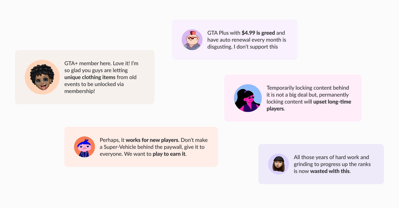
New players view GTA+ as a positive shortcut, while veteran players see it as undermining their prior effort. The mixed players inbetween lean to dipping in for special events. It looks to me player didn't view GTA+ as an enhancement. We were unclear about its structured value over time.
We didn’t know how to talk about GTA+ in a way that felt clear and actually useful to players.
Digging deeper, I realized internally, no one could fully articulate what was GTA+ about. Exclusive access? Long-term savings? Enhanced gameplay? Different teams had different takes . Without alignment, the messaging felt fragmented.
my approach
To prevent false assumptions from creeping into design decisions, I started by mapping what we knew, and what we didn’t. I went through all GTA+ perks from the past year, spotting patterns in one-time offers and recurring benefits. From there, I organized the scattered input into value pillars, separating short-term perks from long-term benefits.
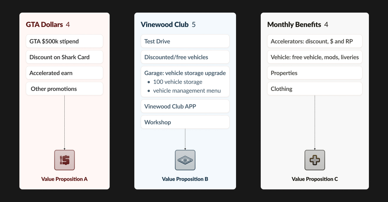
Outline Value Proposition
Then I shared it with PMs, live services, and marketing stakeholders. Having something concrete on paper gave everyone a clear starting point. It made disagreements specific, and kept discussions focused. This helped us pinpoint the exact GTA+ value we want players to see. Once we agreed on the core value proposition, I moved on to build a clear storyline for GTA+.
Like telling a good story, we needed vivid examples to bring each point to life, and do it visually.
I studied the non-member experiences of 25 top entertainment and lifestyle subscriptions, looking at how they framed value, sequenced content, and built trust. This showed me where GTA+ fell short and how we could design the page to not just explain the perks, but make players feel the excitement to join.
Creating a shared vocabulary, terms like “Hook” and “Value Prop” gave everyone a common way to talk about the content. It kept discussions focused on the hard questions, like how much to preview and which types best showed the membership’s value.
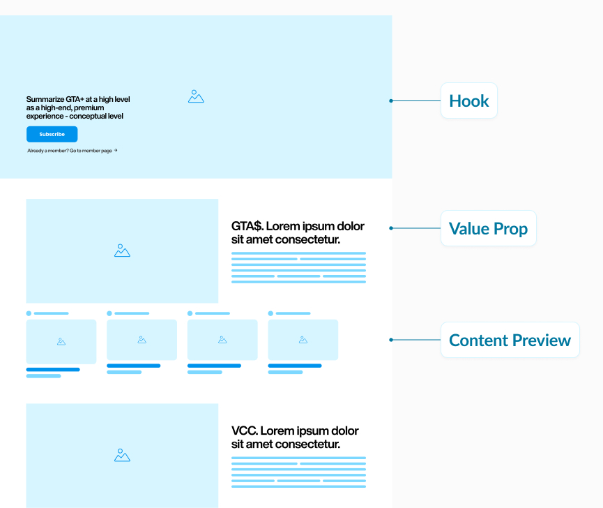
I studied the non-member experiences of 25 top entertainment and lifestyle subscriptions, looking at how they framed value, sequenced content, and built trust. This showed me where GTA+ fell short and how we could design the page to not just explain the perks, but make players feel the excitement to join.
my approach
To reinforce the perception of abundance while maintaining clarity, I partnered with our visual designer and illustrators to give visual flavors to the storyline. I experimented with a split-column layout: a sticky left column that anchors the core benefit categories, and a scrollable right column that continuously previews rotating content.
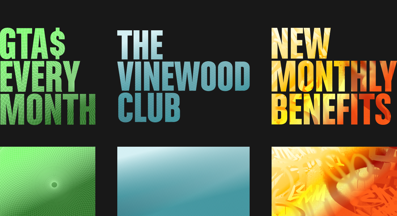
Create Visual Theme to Each Value Proposition
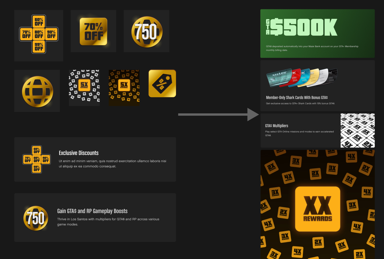
Visual experiments that helped us land on the card component
The goal was to shift from listing perks to helping players understand the full value of GTA+. The themed perks backed up with imagery and microcopy makes each value proposition feel tangible and relevant.
my approach
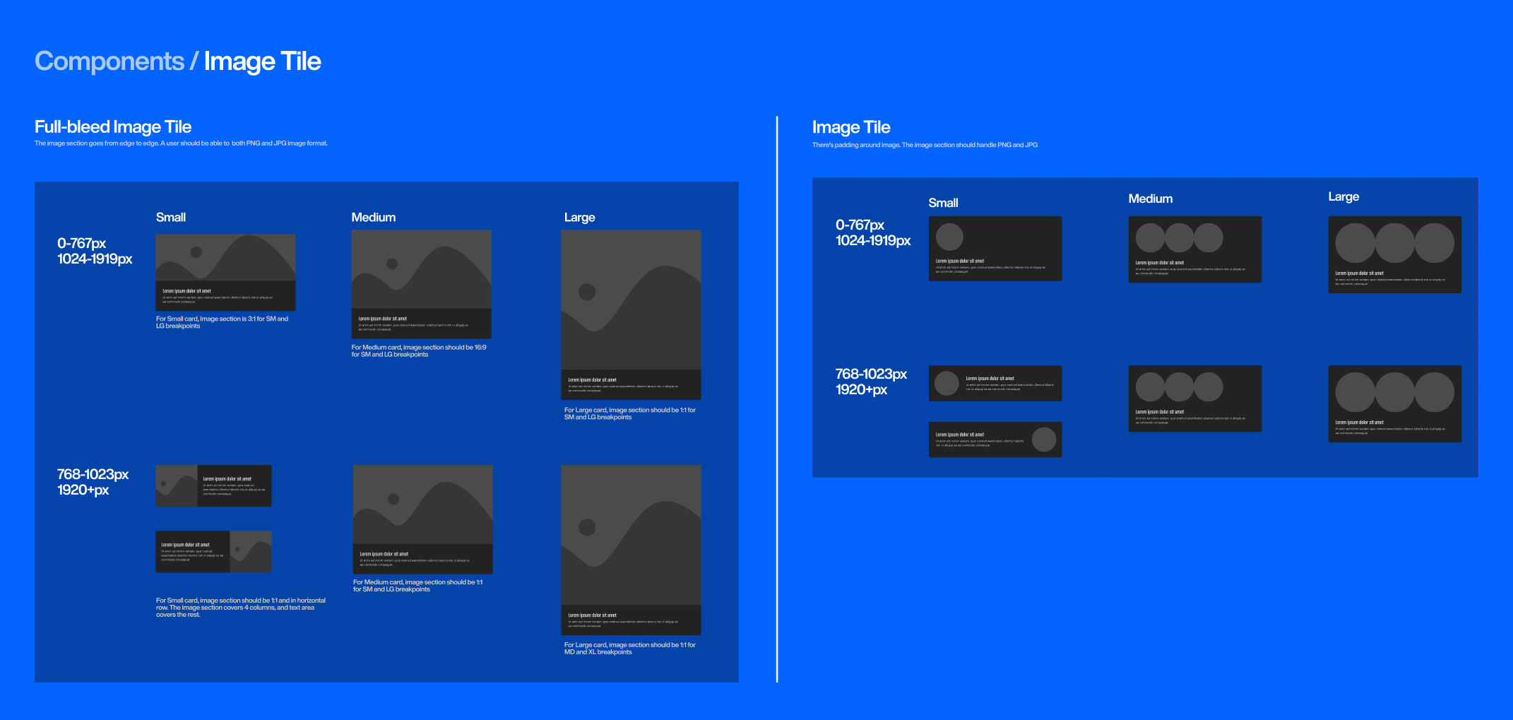
To support scalability and maintain consistency across future updates, I broke down the page design into modular, reusable components. These included image tiles, text sections, and full-bleed media blocks, each adaptable across breakpoints and optimized for different content types. I documented and contributed these patterns back to the design system, helping expand our library.
CMS-friendly modules enabled quick updates as benefits evolved. Components were added to the design system to scale across other web spaces.
the outcome
The redesigned page increased click-through rate by 212%. The modular structure also allowed the editorial team to update content as GTA+ evolved.
More importantly, this project reshaped how we talk about GTA+. By clarifying the value proposition and aligning teams around it, we built more than a landing page, we created a narrative framework for GTA+ moving forward.
For me, the biggest lesson was this:
Clarity isn’t something you design at the end, it’s something you lead from the beginning