Designed systems that empower non-designers to build brand-consistent experiences at scale
my role
Lead Product Designer
Impact
+33% session Duration
Duration
2 Months
With the GTA6 release on the horizon and a surge of new and returning players expected, leadership aimed to turn Newswire into a true destination. The original newswire experience, a longform blog layout, wasn’t serving our players well. Players were turning to third-party channels for updates instead of our official site. Our team is tasked to rebuild the newswire experience to better engage players with in-game events, preparing for GTA6 release.
I led the design of the news experience, from strategizing to delivering final design specs. In addition, I worked alongside a UX researcher, three content creators, and two product managers. The new experience launched in July, 2023.
the approach
Redesigning “the news experience” was a broad ask. Before jumping into wireframes, I needed to understand what was actually broken.
The first question I asked was simple: What’s going wrong with our weekly in-game event updates?
To get answers, I teamed up with KJ, our data scientist, and Bob, our UX researcher. We started with scroll-depth data and quickly spotted a red flag: over 63% of users bounced after scrolling just a third of the page. That told us something wasn’t working—but not why.
Was the content satisfying users' needs up front? Or were they losing interest before they found what they came for? To uncover the why behind the numbers, I turned to the player community and proposed a round of user testing, to get closer to the people behind the data.
the insight
I paired with Bob for a user testing plan. We recruited a mix of participants representing both casual GTA Online players and veteran players. During user interviews, we asked open-ended questions about how players stay informed about GTA Online updates. In usability testing sessions, participants were given tasks like "Find the latest GTA Online news updates" and observed.
Through these sessions, a clear contrast emerged between new and veteran players in how they interacted with the newswire:
- Casual Players: Newer or less experienced GTA Online players often felt overwhelmed or lost on the Rockstar Newswire. 5/7 admitted they weren’t sure where to look for GTA-specific news amidst the broad “Newswire” content. In fact, a recurring observation was that newcomers assumed GTA Online updates would be under the dedicated GTA Online section of the site (or even within the game itself), rather than on a general Rockstar news blog.
- Veteran Players: Long-time GTA Online players, on the other hand, were more familiar with Rockstar’s quirks. They tended to scan quickly, looking for keywords or titles of interest (like the name of a new update or weekly event). If the page presented a wall of text or mixed content, these experienced users would skip past information they deemed irrelevant. 7/7 mentioned that they rely on community summaries (YouTube, Reddit) if the official news felt cumbersome to parse. This indicated that even though veterans knew where to find updates, the current Newswire layout wasn’t optimally serving them either – it slowed down their information gathering.
The research underscored a critical point: a combination of difficult wayfinding and one-size-fits-all info representation discouraged users from returning to our site for news info. This begged the question, "How can we design a content browsing experience that satisfies both detailed and high-level browsing?"
From Insights to Ideas
Armed with these insights, the team regrouped to brainstorm design solutions. The goal was clear: make it easier for all players to find and consume GTA Online news, regardless of their experience level, and align the site with user expectations. Several guiding principles emerged from the research:
- Surface GTA Online Content in Context: To address the expectation gap, the team considered ways to integrate GTA Online news into the GTA Online site.
- Improve Scannability and Engagement: The scroll-depth findings implied that the current page perhaps showed too much content in a long scroll, causing users to drop off. We aimed to present news in a more compact, scannable form that still invites deeper reading for those interested. This is where the idea of a flexible, expandable card-based component came into play.
design solution
At the time, we had card component in the design system. Clicking on cards take users to a new page. What if, in this case, the card itself could expand in place to reveal a longer excerpt with more details? I began to play around with the expandable card concept.
An expandable card interface inherently deals with the scroll-depth issue: by showing summaries up front, the page initially remains short and scannable, and users choose to expand only what they want. It’s a way of progressive disclosure – showing a little and letting the user retrieve more, which keeps both types of players happy.
Collapsed view: clean summaries with quick-glance info and hover previews.
For veteran players, the card layout makes scanning efficient. Users can quickly swipe through a series of concise update cards. If a title doesn’t interest them, they simply move on.
Transition: exiting expanded view lands users back on the card they were reading
For new players, the expandable cards provide more details. Instead of one giant news feed, the updates are chunked into digestible pieces.
The flexibility of the card-based approach also means the component can be reused across the site. The team envisioned that the same card UI could be embedded on the GTA Online page. Because the cards are a self-contained design, they adapt well: in a narrow sidebar they might show just titles; on the main Newswire page they can appear in a grid or list with images, etc.

Analytics built-in: card clicks and hovers give the team precise insights on what content resonates with users.
Previously, with the longform blog layout, it was nearly impossible to tell which specific event details were resonating with players. The best we had was scroll-depth data—useful, but vague. We could see how far someone scrolled, but not what actually caught their attention.
With the new card-based design, that changes. Now, we can track exactly which event cards users click on or hover over. This gives us a clearer picture of what types of rewards or content spark interest, helping the marketing team plan future events with rich insight.
service design
The biggest challenge I faced throughout this project was balancing moving forward with designs, whilst collaborating with the wider team. After walking through the design with the content team, we got push back. It was clear that if the new design disrupted the established flow – even unintentionally – the content team might resist using it.
The weekly publishing workflow content team followed was a well-oiled machine. Every Thursday, the team would prepare a GTA Online event post for the Newswire. They had a checklist-driven process: draft the content, source images or videos, get approvals, and publish. I joined them in a few of these cycles as an observer. By doing so, I had a clear picture of the pace and pressure they faced each week. This helped reveal how the card design might integrate without adding friction.
How may we empower content creators to populate dynamic content without adding work to the existing creation process?

CMS tooling structure
service design
To ground the design in reality, I conducted an audit of one year’s worth of Newswire posts with the content team. We listed out every post from the past 12 months. Together, we went through each post to see how content was structured and what media elements were used. After several rounds of review, we identified a handful of common content combinations used on the Newswire:
- Image + Text: The most common format. A striking header image or gallery followed by a written update or article. This was used for event announcements, new feature spotlights, etc.
- Video + Paragraph: Often for big announcements (like a new trailer or gameplay video), the post would embed a video at the top with a brief descriptive paragraph or commentary below.
- Text-Only Updates: Occasionally, there were short news blurbs or bulletins with no accompanying media. These were rare but important as a baseline case (ensuring the card design could handle a text-only entry gracefully).
- Mixed Media (Multiple Elements): Some posts combined several elements – e.g., an article that includes an image, a quote block, and an embedded tweet or a list of patch notes. These were more complex and represented potential edge cases for the design.
Going through this audit together gave us a clear picture of content diversity – from simple posts to media-rich stories. It also gave the content team confidence that we truly understood their content; it wasn’t just about a pretty UI, but about faithfully presenting what they produce every week.

service design
After cataloging the content, the team categorized each post type and discussed how it would translate into the new card format. The exercise highlighted numerous edge cases. A few notable ones included:
- Multiple Media Items: Some articles had an image slideshow or multiple videos. How would the card handle multiple thumbnails?
- Extra-Long Text: A couple of posts (like year-end updates) started with unusually long introductions before any media. In a card, too much text could be problematic. The text should be enough to inform, but not so much as to overwhelm the small card space.
- Special Formatting: Posts with tables of game stats, or the poem-like layout mentioned earlier, could look odd if naively squeezed into a card template. The card design might need rules to strip or adapt certain formatting when displaying in condensed form.
I sketched out how each edge case might look in an expandable card and took notes on what limitations might need to be built into the system. This upfront analysis meant that later, when engineering would implement the design, they’d have clear guidelines on handling varied content.
Throughout this process, Mike, Sam, and Tiffany felt increasingly invested. In turn, we benefitted from their domain knowledge – things you’d only know if you handled content every day, like which types of posts are most popular, or which ones are internally considered templates for recurring events. This mutual exchange cemented trust among the team.
service design
With a deep understanding of the content, I moved forward to align the new card design with the existing CMS tooling. The content team kept emphasizing that the Newswire is the “source of truth” for all updates. Whatever appeared in the game or any other channel must match what was on the Newswire to avoid confusion. This underscored that duplicating content in multiple places could lead to discrepancies if someone forgot to update one version. The design solution, therefore, needed to respect that the CMS/Newswire content is sacred and should directly feed any other representation (like the card collection) rather than require separate editing.
I proposed implementing a simple CMS toggle that lets content creators decide which content appears in the GTA Online card collection.
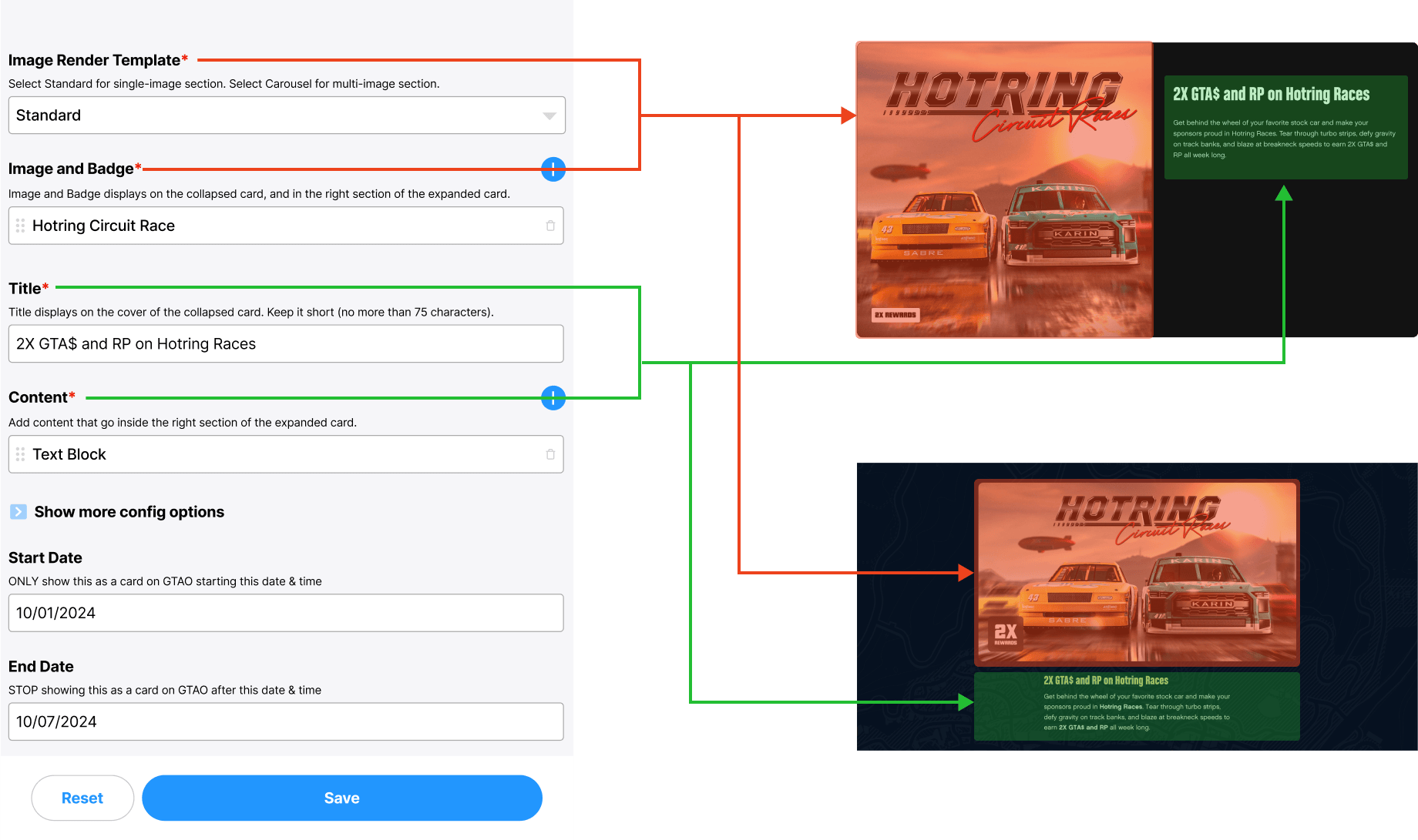
One content, multiple destinations. A single piece of content serves two destinations—without any additional effort from content creators.

CMS toggle that lets content creators decide which content appears in the GTA Online card collection.
no extra work was required beyond a single click. Crucially, it kept the Newswire as the primary source of truth – the content team still wrote their article in one place, and that single source content would serve multiple destinations. The card that players or readers see in the GTA Online section would pull its title, image, and snippet directly from the Newswire entry. In other words, the Newswire post was like a master record, and the card was just another way to view that record.
The engineering team confirmed they could implement the toggle with a day or two of work and that it would not affect the rest of the CMS. Once toggled, the system would tag the content behind the scenes or mark it in the database such that the GTA Online section could query for “toggled on” posts and display them as cards. Hearing this was a relief – it meant the design vision could be realized without months of back-end refactoring.
Detailed Design
I was under pressure from stakeholders to quickly revamp the design, leaving little time to build something from scratch. To meet the tight timeline, I began by exploring our existing design system, looking for established components we could reuse. At first, a simple row of cards appeared to be the obvious choice—but it quickly became clear that it wouldn’t fully solve the user experience challenges we faced.
After experimenting further, I landed on a two-row card deck layout. It provides the right balance, and miximizes the amount of information displayed at a glance, while maintaining visual consistency across our platforms. But it raised another question: what about the expanded state? I explored ways to allow users to expand the entire deck, giving them the flexibility to browse detailed information without leaving the expanded view.

Design specs for the new interaction behavior
On top of solveing the immediate business problems, I saw this as an opportunity to enrich our overall design system. By integrating these new inetraction patterns, we strengthened the flexibility and usability of our card components, offering a more intuitive browsing experience without requiring extensive new development, while benefiting not just the current project but future initiatives as well.
Detailed Design
After refining the core user flows and polishing the UI, I felt the new design still lacked a certain engaging quality—I couldn't pinpoint exactly what was missing. I decided to bring the issue to broader design group discussions, hoping to gain fresh perspectives. During one conversation, Bobby suggested, "Maybe you could add micro-interactions?"
Initially, I was hesitant. Micro-interactions often seemed overused and decorative, implemented without clear purpose. If we were going to add animations, they needed to serve a meaningful purpose. I stepped back to reconsider the specific user problem we were solving. The primary goal was: offer users a seamless, intuitive way to transition smoothly between the collapsed (zoomed-out) and expanded (zoomed-in) card views, to keep them oriented. We need to ensure users land on the same card after exsiting expanded view, allowing them to effortlessly browse all available events.

Mapping out logic behind the transition
To visualize this clearly, I sketched out the logic behind the interaction, carefully numbering each card to outline how they should move between states. This approach provided clarity—both visually and logically—and helped us to get PM on board.
However, we encountered initial resistance from engineering due to complexity concerns. To address this, I closely collaborated with Kyle, our senior frontend engineer, walking him through the interaction's logic step-by-step. Together, we refined the concept into a feasible, performant implementation.
Detailed Design
As the complexity of our design increased, it became essential to document the animations thoroughly. Engineering teams needed detailed, tangible references to move forward confidently. Recognizing this, I saw an opportunity—not just to clarify this particular animation, but also to standardize animation principles across our entire digital ecosystem.
I initiated a documentation effort within the design team to capture animation guidelines comprehensively. The goal was to strike a careful balance: pushing our animations toward a refined user experience without overwhelming engineers. Clear, consistent documentation would enable us to sustain high-quality animations without continuously taxing developers.
Partnering again with Bobby, we defined animation standards and best practices. These guidelines addressed key questions: How should animations look and feel across different scenarios? What common UX patterns could we elevate with subtle yet engaging animations? Ultimately, our documentation was designed to be scalable and easily integrated into Storybook, making it accessible for all teams.
This systematic approach elevated the overall user experience across sites—simple yet engaging interactions enriched the UX without compromising efficiency. Our carefully crafted documentation ensured consistency, reduced confusion, and streamlined future design efforts.

Animation Documentation
Partnering again with Bobby, we defined animation standards and best practices. These guidelines addressed key questions: How should animations look and feel across different scenarios? What common UX patterns could we elevate with subtle yet engaging animations? We designed the documentation to be easily integrated into Storybook, making it accessible for all teams.